


RVD-
#1) A sign much like this has been rumored to be a serious choice
to replace the Interstate shield. This is a hoax. It is both ugly
and generic. (Not my
design- RVD)
#2) Interstate 2000? A four digit
sign may look this way, if one is ever posted.
#3 & #4) Maybe future Interstate signs will look like this?
It is not very likely that they will change the Interstate
shields soon. It is the only place a USA lower 48 outline might
ever get used, besides it is a non-cutout design. If they must
change to a square / rectangle, a two-tone blue background with
the lower 48 states would look nice in the main body area, Alaska
and Hawaii would use state shapes in this area. The state name
could get printed in white in the lower left corner.
Monte Castleman: In regards to your proposed square
interstate shields (designs #4 and #5), they look almost
identical to the Minnesota state highway markers. The only
difference visable at a distance would be the red on top instead
of gold, so if this design were ever used Minnesota would likely
have to change their state highway markers to something
different.
#5 & #6) Right now there is
no difference in the shields used on a 'TOLL' or a 'FREE'
Interstate Highway. My proposed shield for the tolled ones is a
white Interstate shield with black numbers, with a green banner
area with the word 'TOLL' in big, bold letters. The word
"Interstate" would be moved to the body of the shield,
with a even smaller state name below it on trailblazer signs. It
would be easy to translate on weather maps, too, an interstate
shield shape with a green top. I can not claim credit for the
basic idea, Florida does something similar with its tolled state
highways.

These signs were also contributed by Nick Christensen, who maintains the Vegas Highways page. These designs for the Interstate and US highway shields are based on a stylized eagle's head / I for the interstates, and a red eagle's head with an upraised blue wing for the US shield. (Bigger version of the US shield is at Big Signs.)


From Luke Wright: My attempt at a sign for tolled interstate routes. I saw your (RVD) signs (green on top of white) and I think they're good - I have a similar idea. However, while I think they would be OK on its own, it might look a little less impressive on an overhead gantry. So what I thought was, keep the basic sign, but make one of the two parts yellow. The one with the yellow bottom would stand out enough on a gantry, and wouldn't look too far out of place on its own. There's also two choices of where to put the word "TOLL" on the sign.

From Cody Goodman: Attached is an Appalachian Route marker that is based on one that Stephane Dumas did.)


From Cody Goodman: I chose green for the BUS US Shield because it would go along with the business interstate shield. I chose brown for the scenic shield because it would match the standard color for signs that direct you to scenic destinations. I chose blue for the APD shield because it matches the color of the one that I sent you earlier, and all other signs that I have seen that involve Appalachian Development are blue. I chose an inverted theme for the alternate shield because I shield that I saw in Florida were inverted like this. I chose red for the bypass shield because it is kind of opposite of the green BUS shield. I chose orange for the temporary shield because it is would go along with construction. This shield could also be a detour shield as well. I chose the light blue color for the truck shield and the lavender color for the future shield because I could not think of any other color for those shields.


From Jed A. Wilkinson: Here are some of the colors for the US Route like: Gray for the Historic Routes to pay respect to our Heritage. Brown for the Indian Routes to pay respect to our Native American since they were here first and they helped feed the pilgrims that landed in Massachusetts since they grew most of the food in the US. Blue for the North and South Routes (odd Numbers). Red for the East and West Routes (even Numbers). Light Blue on Black for the River Roads since the water is blue to pay respect to our precise resource which is water. Yellow on Black for the ones in Alaska and other states that have a lot of snow in Winter since it's dark for 6 months (October to March) in Alaska and also to prevent accidents especially at night! Green for the Scenic Routes to perserve our environment and respect our forests. Green on Brown for the Parkways same apply as for Scenic Routes! Reason for those colors especially Blue and Red on all US Routes is to pay respect to our Country. Using the Current Minnesota Shields is Cool but why not highlite the state on the Map of which state is in instead of Writing it on the lower left hand corner of the shield that way it make more sense also they see what state their in especially truck drivers.
From Pierre-Yves Viau-Poirier : 100% percent American! I even designed the directional plate to fit with the shield, Consider a color code for the plates, WEST and SOUTH would have red outlines with blue letters while EAST and NORTH would have blue outlines with red letters.


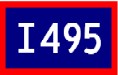
From Ernie Tripp: The 495X Shield is my proposed universal State Route Expressway / Freeway shield. I also have versions for US Routes that are Freeways (3X and 6X) The Red framed US 6 would become the new non-Freeway US Shield.


From Gene Van: The first is is a concept for the US highway shield similar to the Interstate sign, but with the colors reversed and keeping the black text. This is the square-sign version. The second is similar to the other redesigned sign except using the cutout scheme like the signs used in the 1940s. The third uses 1940's lettering. The next sign is for submitted sign design belongs on only one stretch of Interstate: Shuster's Folly. The attempted pig silhouette signifies the road's pork-project nature. Since California's I-238 gives roadgeeks indigestion, here's the change: the background colors for that shield in "puke green."

From Kyle P. Hoger: The background - comprising the state outlines of MT, ID, UT, NV, and AZ - is the logo for the Canamex Corridor Coalition. I envision it as a supplemental shield, sort of like the Avenue of the Saints shield.


From Ed Miessner: 1) Is a horror - this is what I figured would be posted on all our Interstates if that rumor came true about the USDOT deciding to go to square Interstate shields. 2) 3) and 4) are tricolor square shields. Kind of bland, but functional. 3) and 4) resolve the I-99 and I-238 conundrum by using the British method of posting isolated Motorways on their "A" routes. In other words, I-99 is US 220 (I) and I-238 is CA 238 (I). shield.


More From Ed Miessner: Well I put my imagineering (I know! BAD Disney spelling!!!!) in gear and came up with these. The first two are intended for US Highways with Interstate characteristics, i.e., fully-controlled access with breakdown lanes, where possible. These two have the "modern" US Highway Sign shape outlined blue shield with with contrasting blue surround and differently-colored "expressway" banner -- same as for Quebec's Autoroutes. No. 1) with the red banner would be for freeways and 2) would be for tollways. The remaining eight are for the other US Highways and possess a distinctly 50s retro look with the banner inside the colored shield. The color coding would be for different types of routes, like Cody Goodman's signs and AJ Froggie's idea for bannered routes at his website. 3) would be for the mainlines. It is red, white and blue with either "United States" for the banner, as shown, or with "US" alternatlvely. 4) would be for the posted Alternate Routes; the numeral field and the banner switch colors. 5) would be for the Truck Routes, black for heavy trucking. 6) would be for the Business Routes. Its field is green, the color of money. All Business and City Routes that link to the mainline at both ends plus all "Loop" Routes would be marked as "Business Loop" as shown. All mainlines that have Bypass Routes going around an urban area would also become Business Loops; the Bypasses would then become parts of the mainlines. Also, all Business and City Routes that link to the mainline at one end *only* plus all "Spur" Routes would be similarly marked as "Business Spur." 7) could be for tolled sections of mainlines that are not otherwise interstate quality. It could also be used for tollways if it is decided on a national basis not to use the first two. 8), 9) and 10) are the pleasure-oriented travel routes, brown on white. 8) would be for the Historic Routes. 9) and 10) would be for Scenic Routes. An' a tip' o' the ol' hat to ye for 10) -- your US Highways 1 to 830 website with its Route A1A idea inspired that last one!
This page last edited Wednesday, May 21, 2008
 Return to Highway Makeover