
Official: Yet another victory for the forces of umm, well, color? South Carolina changed its route marker on June 19, 2007, away from the square & S.C. to this snazzy version. More information is at the SCDOT website. The image from thier website.

RVD: This sign is based on the state highway shield from the 1920's and 1930's, when the Palmetto State's highway sign featured a state outline and the words, "State Highway" in a arc over the number, and S.C. below. This sign would lend itself to coloring, filling in the state or the border with a color to make it stand out, but I decided to keep it simple.

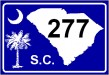
From'Jaguar' James Allen:A mutation of the flag of the state. I think the flag is the best of all the states.

From David Kendrick: South Carolina uses the boring box now. Add the crescent from the state flag and make it blue (reverse the state flag colors), move the numbers up to the corner, and put the state name on top, and the result is a very clean design that carries a state symbol, just as recognizable as the palmetto but a lot simpler to recognize. (And certainly easier to put on a sign than the other state symbol, the roadside video poker parlor.)
From Albert Calis:I liked 'Jaguar' James Allen's shield design, modeled after the state flag. I decided to do my shield also modeled after the state flag, but I moved the crescent moon directly on top of the Palmetto Tree, and I included the state picture. I also included the S.C. on the bottom to fill the empty blue space. I guess if you look at it closely, it looks kind of a fusion of RVD's and Jaguar's shield designs together.
 Return to the Highway Makeover
This page last edited Sunday, April 27, 2008