
![]()
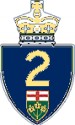
From Michael Butler: Ontario needs a face lift in signs. 1) The King's Highway Sign has seen little change in some time, and I think it is time to add some colour to this one. Blue, red and green and yellow all official colours. The word Ontario would not be required, it would quite clearly state it with our province's crest. You couldn't mistake it for someone else's. I thought the yellow on blue make great colours because they're used on OPP vehicles already. 2) & 3) Two new City of Toronto signs. One is an overhead sign and the other smaller one is the side marker. Toronto has used the same old puke green and yellow circles that you have to twist your head to read since at least the 60’s for the Don Valley Parkway and the Gardiner Expressway. Everyone is familiar with the city’s twin towers of city hall and Nathan Phillips Square. Blue is used signifying Toronto’s proximity to water. I’m sure that Fredrick G. Gardiner, Metropolitan Toronto’s first chairman would be proud of this facelift. The expressway was originally to link with the 401 in Scarborough and the extension from the D.V.P was cancelled in the 1970’s.
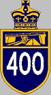
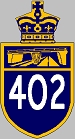
From Ed Miessner: A redesign for Ontario's 400-series route markers. The layout is the same as for the Quebec Autoroutes, but I added the typical crown at the top and changed the colors to conform to those on Ontario's QEW expressway, but with the route# in white.
 Return to the Highway Makeover
This page last edited Wednesday, May 21, 2008