

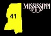
RVD: As part of the campaign to eliminate blandness, the circles all have to go, including the Magnolia state's. The possible new shield on the left would stand out locally, the inverse of Alabama's FHWA-acknowledged highway sign. (It is used as a MUTCD example of what a state shield should look like.) Someone (I forget who) suggested using Mississippi's 1990's advertising logo, that possible shield is on the right, a light grey state silhouette under the state route number.


From Adam "Froggie" Froehlig: Here's my idea for remaking the Mississippi shields. I've always liked how Minnesota's (my home state) looks, so I used a similar design for Mississippi. I've also made them out in red, white, and blue, which incidentally are Mississippi's state colors. They're wide enough to accomodate 3dis, yet don't look crappy with 1 and 2 digit routes. The revised Mississipi shield uses the same general format as what I had offered previously, with a few changes. Instead of being square, I made it slightly rectangular, at a 1.125-to-1 ratio. This makes it easier to include 3 digits at the same font and size as 2 digits, using FHWA Series D font. I also revised the state name...instead of using an italicized font, I included the stylized "Mississippi" logo found in the state's tourism advertising. Lastly, the colors now more closely match the colors on the state flag.

From Marion Svendrowski: For Mississippi I like the one using Mississippi's 1990's advertising logo, but use a color that grabs the eye for the state outline under the state route number.


From Matt Hinton: I chose to use the red, white, and blue bars from the state flag and a magnolia in the center. It doesn`t use all black. Black is boring so I only used it on the numbers. The numbers are also small enough to fit between the red and blue, but large enough to be seen.
From Patrick Sheridan: A slightly modified version of the outline/lettering version.

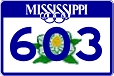
From Ed Miessner: Here are my suggestions for the new highway route signs for Mississippi. I liked both the ideas for using the magnolia in the center and the state's tourism logo in a banner up at the top of the shield. So I obtained the magnolia illustration from the recently-discontinued license plates, the blue banner from their tourism website and modified it slightly (the S's hang outside the banner), added a blue border and blue Series E(Modified) numerals, and voila!


From J. Clevenger: I have created these three signs for Mississippi but I can't figure out which I like best. I got the idea for the first one years ago when they first started to use the lacy script logo on state maps. The second is a new look at the previous marker. The third is a completely new design incorporating the lacy script everyone loves and the magnolia flower. Enjoy!
 Return to the Highway Makeover
This page last edited Sunday, November 09, 2008