
RVD: Kentucky also uses a black circle for their state highway sign, and has for decades. This sign is intended to complement the Tennessee State Highway sign with the fancier script at the bottom. I considered adding a racehorse in the upper left corner, but dropped it to reduce clutter.


From Kevin Hewlett: As many know, we (KY) use the same, stupid circle that bunches of other states use, and frankly, a white circle on a black background dosen't reflect our state! I thought that we oughtta go along with our neighbor Tennessee's design, except we splash some blue on our state's outline ... blue and white is, of course, what our state worships (University of Kentucky's colors). And for the county highways, why don't we keep the circle, but instead use a blue background with blue numbers....that way, we'll all know the difference between the main roads and the dinky little county roads.

From Ryan E. Hague: I used green and yellow, which I believe are fitting colors for Kentucky, and enclosed the road number in the Kentucky outline.

From Patrick Sheridan: It is a nice outline of the state with University of Kentucky colors. I have added KY in the outline, the state name, the nickname, and the tourism slogan.


From J. Clevenger: This is my proposal for a new Kentucky marker. It uses the "Unbridled Spirit Logo" like everything else in the state nowadays.

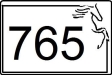
From Anthony Suppa: This is an adaptation of the old-style New Hampshire "Old Man of the Mountain" Signs, except with a Kentucky Horse.
 Return to the Highway Makeover
This page last updated Sunday, October 04, 2009