


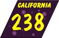
RVD: That green blob thing Caltrans uses is a miner's spade? I'd bet few people outside of California know that. These shields were inspired by the Alaskan and Hawaiian shields CCS came up with. A freeway name has been added to reflect the California fondness for referring to their state highways and other roads by names as opposed to a number like most the rest of the lower 48. California's silhouette was shaded yellow in the two left shields in honor of the "Golden State". To the right of that, a stylized Pacific coastline and Nevada / Arizona border bracket a stretched center space on this cutout shield. Lastly, the sign on the far right was "inspired" by Casey Cooper's Interstate (Indigestion) - 238 page, which states this unusual design and I quote "a mauve rhombus shaped shield with paisley, polka dots and lots of pretty flowers".

From Kevin McGehee: This
shield uses the script lettering and color scheme of the
California license plate -- right down to the metallic
reflectorized background -- on an otherwise plain rectangular
blank. I used the Georgia bold font to distinguish the highway
number from those on other signs. It's less "busy" than
RVD's California shield, and is easily recognizable as
California.
Further comments (Jan 2002) - I think J.P.
Kirby is onto something - why not compromise his design with John
Baltzley's opinion of the "miner's spade" shield (which
I admit I kind of agree with)? This would actually be an updating
of the spade design of the 1940s which included the grizzly bear
at the top. I like it.

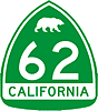
From J.P. Kirby: This design is based on the state flag. The bear design that was once used on state highway markers returns, and the word "CALIFORNIA" is added to the red stripe along the bottom.


From John Baltzley: OK,
I've come up with a few of my own California signs...I'm now
living in Washington, but I was born in and lived in CA for 22
years. I have to say, I'm not too fond of the redesigns currently
posted. We may have a "green blob" that doesn't exactly
point to being a miner's spade, but at least it's NOT SQUARE and
it's die cut. Besides, road geeks like us thrive on wondering
what the origin of the green blob is.
Therefore, let's keep the spade, let's just spice it up a bit.
Here's my ideas...
#1 - Using hwys. 99 and 238 as example - Combine the state
flower, the Golden Poppy from the "Scenic Route" signs
onto the sign. Keep existing green on bottom fading into sky blue
on top with white outlined in black for better visibility.
#2 - Loosely inspired by the California "Sunset"
license plates of the 80s...and using the California outline
behind a hwy. 14 marker from my hometown of Palmdale, CA.
One more thing...Californians are getting more into the habit of
using the numbers...around LA, it's quite a mouthful to say,
"From the Ronald Reagan Freeway to the San Diego Freeway to
the Hollywood Freeway and the Santa Ana Freeway" - it's much
easier to say, "118 to the 405 to the 101 to the 5."(Also
posted in Big Signs)


From Lawrence Meeker: I
agree with John Baltzley's dislike of square signs. As a native
Californian, I find the the non-cutout US route shields seen
elsewhere to be positively disturbing. However, I've never really
been a fan of the depressed-cursive state legend seen on our
license plates.
This design is an example of symbolic overkill. The red bar and
grizzly depict the state flag (as in J.P. Kirby's example). Toll
roads use a green bar instead, similar to Florida's practice of
having different shields on toll routes. The blue numbers on gold
fade display the state colors of blue and gold. And, of course,
the "blob" is still a miner's spade.
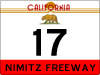
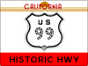
From Michael Hensley: I really liked the California design from J.P. Kirby with the bear on top. I think we have a cool flag (I live in California). I'm not one for gradients in signs, but that's just me. My design for California is similar to the Kirby one. I used the stylized "CalifOrnia" from our coolest (but, unfortunately, short-lived) license plate design. I kept the bear, but unfortunately, he's gotta be smaller (incidentally, state park metallic signs have a bear silhouette in the lower right hand corner). I liked the idea of putting the highway name at the bottom. Southern California freeways are known more by name than number -- so it would make a lot of sense. Here, in Northern California, our freeways are known mostly by numbers -- but if you said Junipero Serra Fwy (I-280), "The Bayshore" (US-101), or the Nimitz (SR-17 / I-880), most people would know what you're talking about. I've also made a design I think would be neat to use on historical highways like US-99 and US (now State Route, in many places) 66. California has many "novelty numbered" highways--like hwy 49 (significance: 1849 Gold Rush... it goes through the gold country) and hwy 82 (significance: it's the El Camino Real...the road between the California missions. The first mission was established in 1782).
From Artist Jake: I've always really liked the bear shields; and am suggesting a compromise between that, and the modern spades. The state nameappears at bottom, the traditional bear at the top. Shields would be 24 inches high and 20 inches wide, and scaled as needed for freeway visibility. I like the green and white colours... simply, I'd like to *bring back the bear*!

From Patrick Sheridan: This is a red state outline-on gold design, originally the state name was supposed to be copied from the state license plate, but it didn't work. (Oh well.)
 Return to the Highway Makeover
This page last updated Wednesday, January 23, 2008