|
|
Master line value to give depth to your layouts
from Signcraft magazine; January/February, 1989 issue, pp. 77-79
by Mike Stevens
Mike's third article in this series tells how contrasting line value
can strengthen your designs
Have you ever had the experience of standing back and looking at a sign
that you have just finished, anticipating a masterpiece, only to have
it wilt before your eyes? Of course you have.
We all have. Sometimes, it feels like we've been shortchanged by our Maker
when he was handing out talent.
It is a rare occasion, indeed, when an artist is totally satisfied with
his or her work. There is always something that can be improved. But what?
That's the catch. What is wrong with the layout?
The secret to your growth lies in your ability to see and talk about the
problem. Otherwise, you are just guessing and not building a base of knowledge
to work with in the future. Design is intellectual. It is a rational process
that leads to "acquired talent." It isn't free - your Maker didn't shortchange
you. He blessed you with natural talents and potential, but not the skills
of an accomplished designer. The wonderful gift that He did give you was
the means to acquire the knowledge and the power to do the problem solving.
One of the most common problems that sign designers have is monotony of
line value. In an attempt to give their signs more character, they change
alphabets, colors, and the height of their lettering, but few go on to
refine their work from there. A sensitivity to line value will improve
your work immediately. Line value is the relative thickness of line in
letter strokes, ornamentation, illustration, or cartooning. As you begin
to select alternative line values instead of changing alphabets or colors
unnecessarily, your layouts will have more pizzazz and the speed of your
lettering will improve.
Once you begin to work with it on a conscious level, it will add new spice
to your work. I didn't become aware of it as a design element until I
had been lettering for ten years. As a student of show card writing, Don
Sturdivant was my first hero. I used to stay up nights copying and studying
his work. It had a unique flair about it. I began to realize that his
drama of proportional relationships was central to the eye appeal of his
show cards and theater ads.
I didn't understand it as a matter of line value until I saw the fabulous
theater ads of Duke Wellington. He was a true master of line value and
spatial relationships. What made it so clear to me was the way that he
unified his compositions by integrating his illustrations with the lettering.
He used recurring patterns of line value to unify his layouts.
The first time I saw his work, my mind flashed back to a course I had
taken in cartooning, which stressed the importance of using contrasting
line value to create a sense of space and depth in line drawing. After
seeing Wellington's work, I began to put two and two together, and developed
the philosophy that I now teach in my workshops. Signs are much more interesting
when they have a sense of depth and space. Use contrasting line value
to create a feeling of foreground, middle ground, and background.
 A A
|
Direct the reader's eye
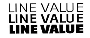
For clarity, think in terms of three distinct line values - Light, Medium,
and Bold. Note the optical illusion in Figure A that suggests a gradation
in color as well as a sense of space. As the line value expands, the words
appear to come forward. The three different line values create a feeling
of foreground, middle ground, and background. Contrasting line value is
one of the techniques that leads the eye through a composition. It gives
you the ability to direct the eye to the most important information first.
My version of light and medium line values is similar to that of most
other designers. However, my sense of bold is what many others would interpret
as super bold, or extra bold. I exaggerate the bold for the sake of clarity.
As a reference, you may use the following percentages in determining the
relative width of a brush stroke. A light line is 10 percent of its height,
meaning that the width of a light stroke for a 10-inch letter would be
one inch. A medium stroke is 20 percent of its height, or two inches for
a 10-inch letter. A bold stroke would be 40 percent of its height - four
inches for a 10-inch letter. Figure A was rendered using this formula.
These percentages do not hold true with condensed or extended alphabets.
Once someone points out the need and advantages of using light, medium,
and bold alphabets, it's easy to understand. However, it is another thing
altogether to be able to execute them correctly on your first try. Take
a few minutes now to draw a light, medium, and bold R, all at the same
height, without using the formula mentioned earlier.
If you're anything like me, or many of the students that I have taught,
your relative proportions did not come out as well as you thought they
would the first time around. It takes more than just getting the words
right. My personal experience was that my intellectual goals and awareness
in design preceded my physical skills by six months or more. I knew what
I intended to do, but my hand and eyes could do no more than my practice
or routine had trained them to do. Practice! Learn to letter a light,
medium, and bold face letter upon command.
Layout is much easier to master when you are working with definite shapes
and clear contrast. In the last article, we discussed and illustrated
the need to create definite shapes with our words and word groups. We
also need to know how to control their density by the use of contrasting
line value and color. Think like an illustrator and try to create a feeling
of foreground, middle ground, background with your word groups.
|
|
Two examples |
|
|
Figure C is much simpler. Focus your eyes on the W in the word OWNER and use your peripheral vision again to scan the rest of the sketch. It is a clean-looking sketch, but I didn't the results that I wanted. |
Using Contrast
Creating eye appeal is one of our main objectives in sign design. Achieving
it sometimes requires that we compromise the legibility of some of the
less important copy. If everything were equally legible on a sign, we
wouldn't have a main focal point, and the sign would become self-defeating.
We need to create contrast so that the eye will have a clear choice as
to what is the most important copy, and also to give our layout flair
and personality - that elusive quality that some artists seem to be better
at than others.
Contrast - clear distinct contrast - is the key to creating flair and
personality in your work. It is achieved by playing big things against
little things, light colors against dark colors, warm colors against cool
colors, sharp angular letters against straight letters, and yes, more
- exaggerated round letters and shapes against condensed forms, tight
letter spacing against double-spaced letters...time out! That should be
enough to get the point across.
Most of this is common knowledge among professionals, but the ability
to achieve is not. The problem is must like the earlier exercise I gave
you in drawing a light, medium, and bold face R.
We know the words, and can appreciate the need and function for the idea,
but the ability to do it escapes many.
Sign artists who have had experience in show card writing are often more
successful in sign design. Water-base show cards paints are a much faster
medium than lettering enamels, which enables them to work quicker and
develop a flair that is difficult to match in enamels. They also develop
a special sense of drama and contrast as a result of their experience
in interpreting and organizing a lot of heavy copy. They learned to move
things around to their advantage.
Take note of the signs that you like. You'll undoubtedly find several
basic features common to all. My guess would be that the three most common
attributes would be appealing colors, a well-organized layout, and clear
contrast between its elements.
If you're not satisfied with the personality of the work that you are
now doing, examine your use of contrasting line values. Are you taking
advantage of the opportunity to create a sense of foreground, middle ground,
and background in your compositions? In order to improve and break old
habits, take things to the extreme. You may over-do it at times, but that
is a small price to pay for your personal growth. You will quickly adjust
as you begin to work with clear, contrasting elements.

 B
B
 C
C