|
|
Rhythm holds your designs together
from Signcraft magazine. March/April 1989, pp. 84-87.
by Mike Stevens
This is the design element that can make your work sparkle
This article is about rhythm as a design element. It's a subtle
element of sign design that can be defined to serve several different
purposes. Once you become aware of it and begin to use it on a conscious
level, there will be an immediate improvement in your layouts. It's one
of those "goodies" that helps your work sparkle.
Rhythm is a recurring pattern of elements such as lines, forms, and colors
that create a sense of direction or an illusion of movement. By their
repetitive use within a given composition, these elements serve to unify
and tie things together. In layout, the goal is to create a "unified whole."
All of the parts should work well together, establishing a sound composition.
The eye should not be distracted by several independent elements, but
should be led through the composition.
Rhythm of format
The first rhythm that you confront is sign design is the rhythm of the
format. (The second article of this series [SignCraft, Nov/Dec 1988]
explained that each format has a vertical and horizontal axis - theoretical
lines around which artistic forms are composed or organized.) The format
has a dominant and a subordinate rhythm. The dominant rhythm of a format
is determined by the longest axis. For example, the dominant rhythm of
a 4-by-8 horizontal sign would follow the left-to-right rhythm of the
eight-foot horizontal axis.
In natural layout, the dominant rhythm dictates the shapes that we create
with our word groups. If your sign is horizontal, then most of
your word groups should be also. When viewed as a whole, the overall
silhouette must be consistent with the horizontal format. If your
sign is a super graphic, your word groups may be either horizontal
or vertical, regardless of the shape of the format. Remember, a super
graphic overpowers the format and causes it to recede as a design element.
As was implied in the above paragraph, words and word groups have rhythm,
as do lines of copy and line spacing. Recurring patterns of color and
line value are very strong design elements that play a more obvious role
in unifying a layout.
Rhythm of words and word groups
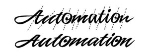
Figure A is an example of the rhythm of a single word. I have used an italic script to make the point obvious. (All alphabets create a rhythm of their own as they are assembled into words.)To simplify the problems that are encountered in layout,
 A A
|
it's to your advantage to keep the individual parts as simple and clean as possible to avoid their calling undue attention to themselves. |
The need for balance and clarity of each part within a composition cannot be overemphasized. The art of layout is in assembling the different elements into an effective whole. To do so, we need to create reasonable shapes with out words and word groups. As Figure A demonstrates, the integrity of each word needs to be considered and modified if necessary. It is impossible to lay out effective sign work with irregular and awkwardly shaped words or word groups.
Italic letters create the most obvious rhythms in lettering. Depending on the severity of their slant, they require more space at the end of each line of lettering to allow for their full expression.
|
The rhythm of italic lettering can be so strong that it creates
the illusion of occupying more space than it actually does. |
|
Dominant and subordinate rhythms
All lettering has both dominant and subordinate rhythms. The dominant
rhythm of italic lettering is left to right, consistent with the horizontal
line. The subordinate rhythm is defined by the italic axis. It is this
subordinate rhythm that is causing the problem with the second example
in Figure B. The letters in the script (especially the capital A and the
two ascenders of the T's) need more breathing space. They are conflicting
visually with the bottom line of the capital letters.
The rule of thumb is to place uppercase and lowercase lettering on top
of a line of all capital lettering, not under it. The theoretical straight
line at the bottom of lowercase lettering relates well to the theoretical
straight line at the top of capitals. The irregular shapes that run through
the tops of lowercase lettering conflict with the straight line at the
bottom of the capitals. The exception to the rule is when one of the two
lines of copy is much stronger in its color and value, thereby dominating
the other and eliminating visual discord.
|
|
Figures C and D make an interesting point. The dominant rhythms of both formats are vertical, yet most of the graphics are horizontal. The boots are the only obvious vertical elements. Both of these sketches work fairly well because the combined graphics form a vertical silhouette that is consistent with the rhythm of the format. Each line of copy is consistent with the subordinate rhythm. It is interesting to note that we are constantly creating rhythms in our layouts, whether we are conscious of it or not. |
|
Figure C is an example of accidentally creating a rhythm of negative spaces that compromise the impact and legibility of the sign. This is a subtle, but very important, point. Monotonous line spacing will kill an otherwise dynamic layout. The goal in this layout was to create two distinct copy blocks: one that incorporated the name and logo of the store and the other that described their products. Figure D was successful; Figure C failed. They both form one overall silhouette that is consistent with the format, but Figure D takes the prize for its clarity. |
|
A few more examples
|
|
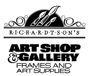
The layout for Figures E and F was inspired by a student in one of my classes. Her version was better. She didn't use the brushes in the top panel, her sketch was refined, and she illustrated a variety of implements that an artist might use. Before I comment further on these sketches, take a few minutes and analyze them. |
|
Figure F has the same problem, only it is compounded by another flaw. The negative space between Richardtson's bottom bar and the next line of copy, Art Shop, is equal to that of the panel containing Richardtson's. Notice how much more legible the bottom bar is in Figure F than it is in Figure E. The clarity of that |
|
One more interesting thing about these two layouts is the use of "captured negative space" as a means of unifying the compositions. Note the relationship between the negative space within the interior of the ampersand, the interiors of the curlicues, and the brushes. A happy accident - it wasn't a part of my original planning.
Start using rhythm as a design element on a conscious level. It's a part of the magic of eye appeal.

 B
B
 C
C
 D
D
 E
E
 F
F