If you are looking at this page without frames, there is more information about medieval writing to be found by going to the home page (framed) or the site map (no frames).
| Page Design (4) | |
| We have so far looked at book page design, but the concept was equally important for documents, both from the perspective of enhancing comprehensibility and for providing dignity and significance to the document as an object. In an era when literacy was only partial, an administrative document may contain a number of non-verbal clues in its layout and design to indicate its function. | |
|
|
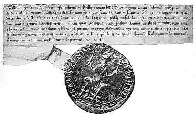
| Charter of William I of c.1070 to the church of St Mary at Coventry (British Library, add charter 11205). (From Johnson and Jenkinson 1915) | |
| The diplomatic of a charter refers to the formula of words which is used, in a highly standardised way, to clarify its contents. One can also think of this as a spatial construct, with certain standard components of the document on a particular part of the page. In a simple charter from England, like that above, the title or name of the grantor is at the top left; that is, if you haven't already twigged it from the exceedingly large seal hanging off the bottom. The first couple of lines is devoted to the names of those to whom it is addressed, the salutation and the notification clause. The bottom two lines or so is for the list of witnesses. So if you want to find out exactly what it is the king has granted to you, you must look in the middle, between these other elements. There is no date on this document, but when dates do appear they will be found directly above the witness list. You can navigate a document geographically, as well as along the linear strings of words. | |
| This spatial arrangement not only makes the document easier to decode, it provides its correct aesthetic, its proper look. If there is anything that might cause a document to be regarded with doubt or suspicion, not looking right has to be right up there as a major cause for concern. | |
|
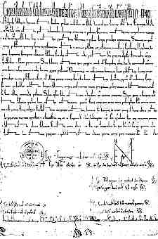
Bull of Pope Eugenius III of 1147 (British Library, Cotton Cleopatra E.1, f.123). (From New Palaeographical Society 1904) |
| When it comes to visually complex documents, like a solemn papal bull for example, the spatial arrangement is even more obvious. There is always a tall, compressed heading along the top containing the name of the pope. There is a long paragraph containing the main business of the document and a certain amount of extraneous ceremonial language. Below that the various stereotypical graphical elements are laid out in a standard pattern, with the date and the rows of signatures beneath them. The seals, not shown here, are attached at the bottom. | |
| You don't have to be able to read this document to recognise what it is, or to know that is a document of the most significant grade. The clues are all there in the design of the page. | |
| And size does matter. What is mysterious is why kings of England had big seals and popes had big sheets of parchment. Perhaps there is a PhD project for somebody in that. | |
|
|
|
|
|
|
|
If you are looking at this page without frames, there is more information about medieval writing to be found by going to the home page (framed) or the site map (no frames). |
|